-
Folks, if you've recently upgraded or renewed your annual club membership but it's still not active, please reach out to the BOD or a moderator. The PayPal system has a slight bug which it doesn't allow it to activate the account on it's own.
You are using an out of date browser. It may not display this or other websites correctly.
You should upgrade or use an alternative browser.
You should upgrade or use an alternative browser.
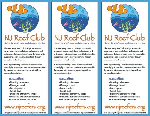
Marketing material - brochures
- Thread starter ecam
- Start date
I like them, but if I can make a suggestion you should post some club pictures groups gatherings tanks and events on there right now it kinda just looks like a info flyer still a very nice one but I think a little bit of pictures might draw a perspective members attention
This is one of two designs we are working on. This one is meant for mass marketing at events. For example our joint event with JSAS at the Monmouth county fair. We are still working on the other design with pictures. @Mark_C has a post out for member pictures. Make sure to submit them! Also note: that would disqualify the picture from being entered into our POTM contest. But just think, it might be forever on our brochures!I like them, but if I can make a suggestion you should post some club pictures groups gatherings tanks and events on there right now it kinda just looks like a info flyer still a very nice one but I think a little bit of pictures might draw a perspective members attention
DangerDave
NJRC Member
I like it!
+1 I agreePersonally, I don't see the need to go too fancy on these flyers as a large chunk of them will get tossed by the individual after viewing.
As long as the key points are listed with our logo, we should be ok <~~that's just me
Personally, I don't see the need to go too fancy on these flyers as a large chunk of them will get tossed by the individual after viewing.
As long as the key points are listed with our logo, we should be ok <~~that's just me
agree
Looks good! I still would like to see more club colors incorporated within the flyer (Even if the boarder color is just changed)
DangerDave
NJRC Member
We have colors? Do I need to get a bandana?
Very nice. Love the color scheme nice logo....great information!
I just assumed our club colors were a maroonish red, white and grey. I may be wrong? That's just the color I've seen of the shirts and the banner on this forum.
DangerDave
NJRC Member
I just assumed our club colors were a maroonish red, white and grey. I may be wrong? That's just the color I've seen of the shirts and the banner on this forum.
lol I was just fooling around bro
I agree but at the same time, disagree.. The reason I disagree is humane nature and attention span yes the flyer has the important info but at the same time theres not one thing that jumps off the page as eye catching or unfortunately interesting if I was walking by and saw that flyer sitting next to something with cool pictures of corals and awesome tanks jumping off the page vs the colorful but yet just a bunch of stuff id have to read threw I'd go for the pictures its like the old joke one some one says they bought a preticular magazine because the articals were interesting we all know they got it cause they liked the pictures.Personally, I don't see the need to go too fancy on these flyers as a large chunk of them will get tossed by the individual after viewing.
As long as the key points are listed with our logo, we should be ok <~~that's just me
Being this is are main point of advertising unfortunately we may have to take the gamble of going a little fancy in hopes more people might actually grab it and keep it. But I do get what your saying TRio cost vs effect we need to recruit as many as we can get


